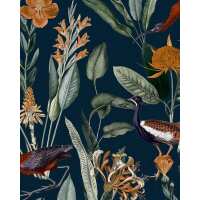
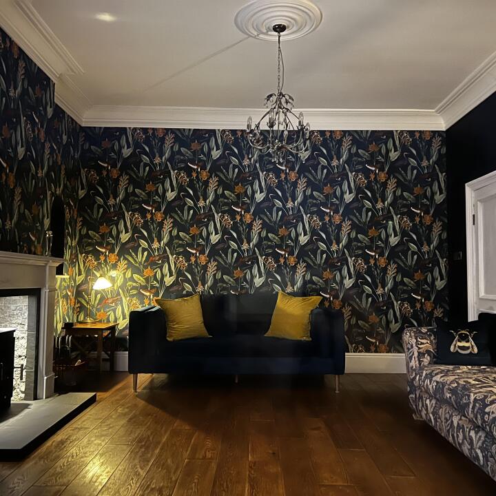
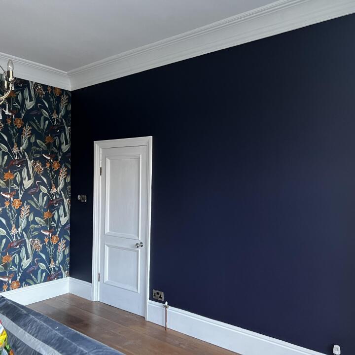
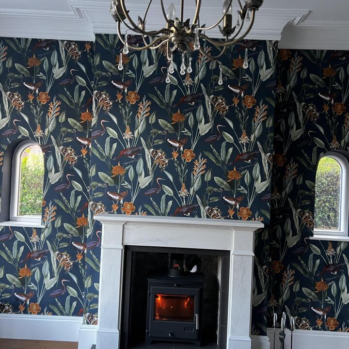
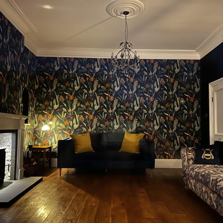
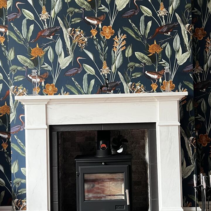
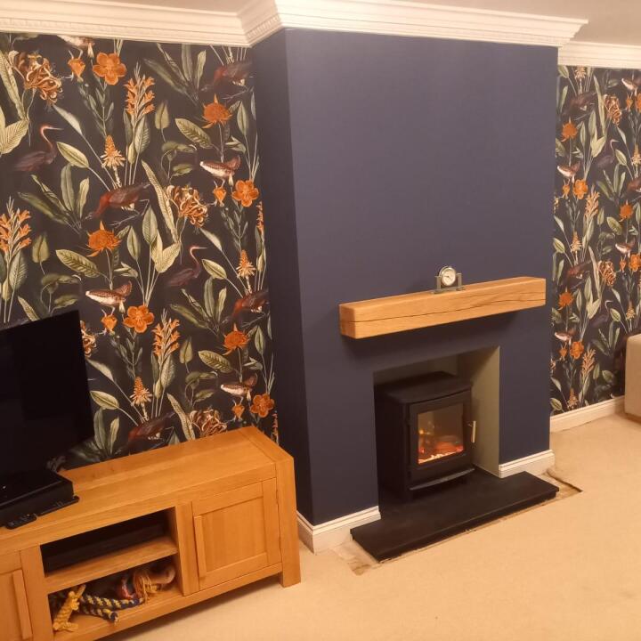
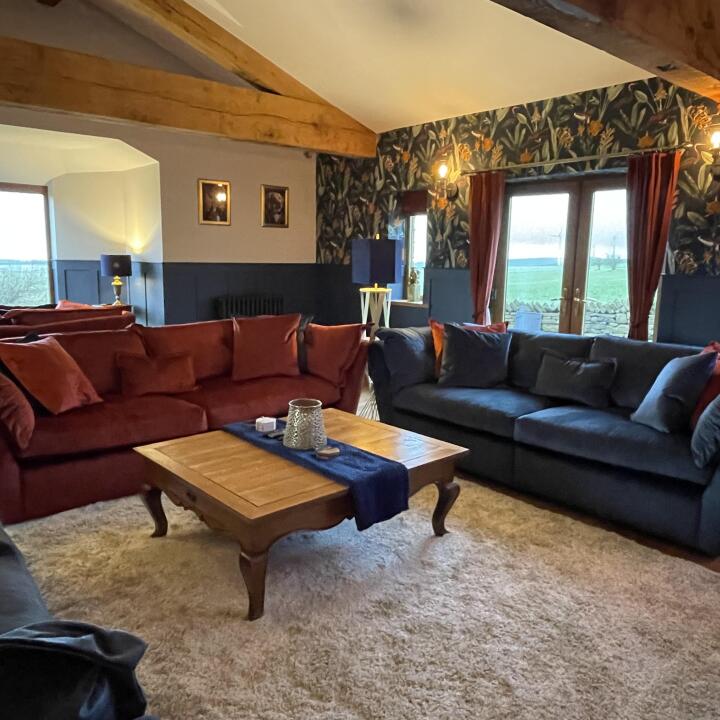
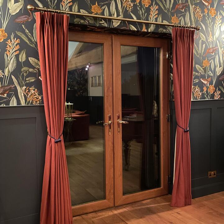
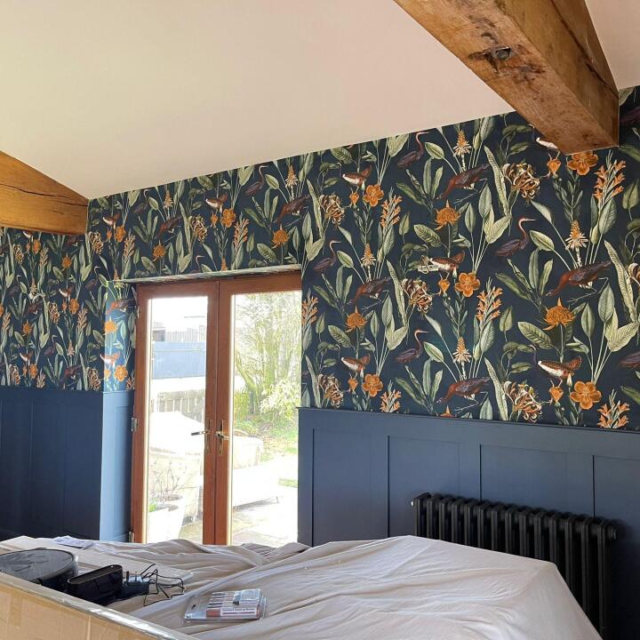
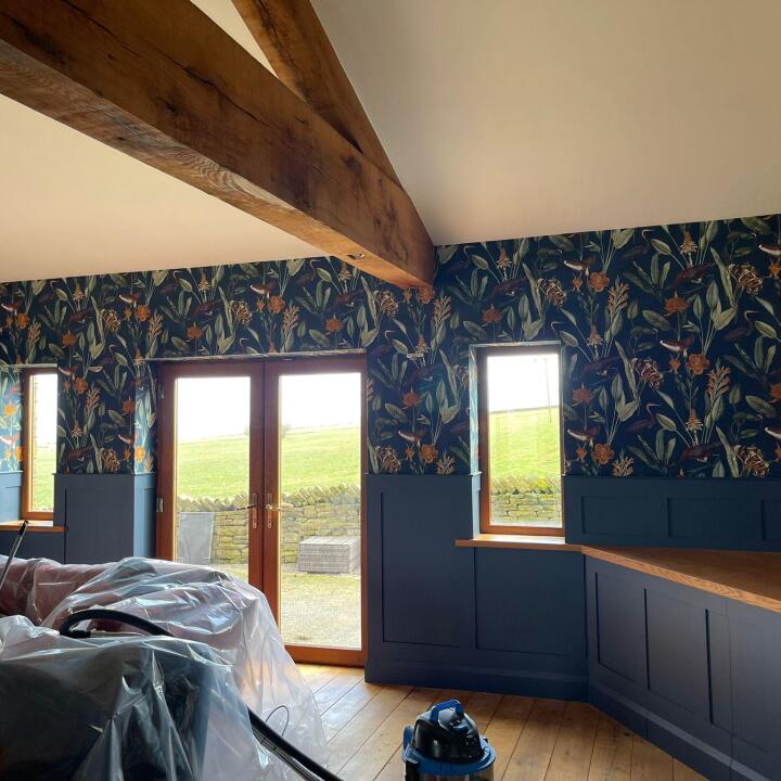
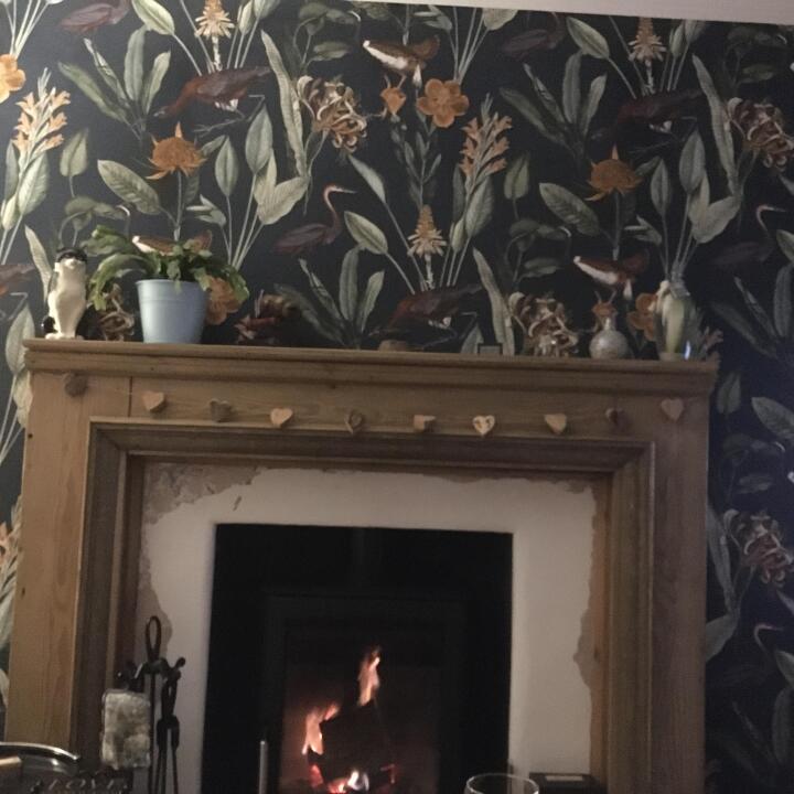
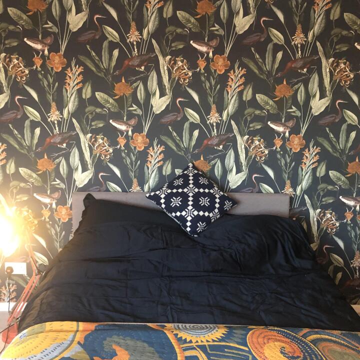
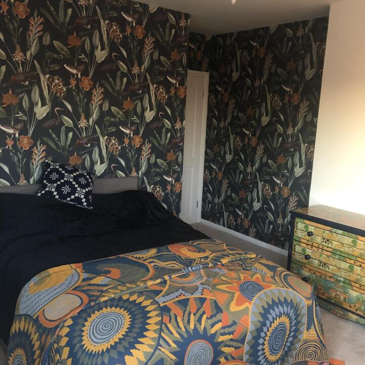
“Love the wallpaper. Background color is more subdued navy versus a vibrant navy blue as shown. Get extra!! Maybe because the product was on back order a small portion of the navy did not print on the paper so I was unable to use at least a fifth of the roll. I’ve used Graham & Brown before, and never had that problem. I’ve paired the wallpaper with Behr Midnight Blue and Benjamin Moore Bronze Tone.”
“Not quite navy, more of a charcoal blue which tones with grey as well as blue, but a beautiful design, highlighted with golden yellows which really warms the design.”