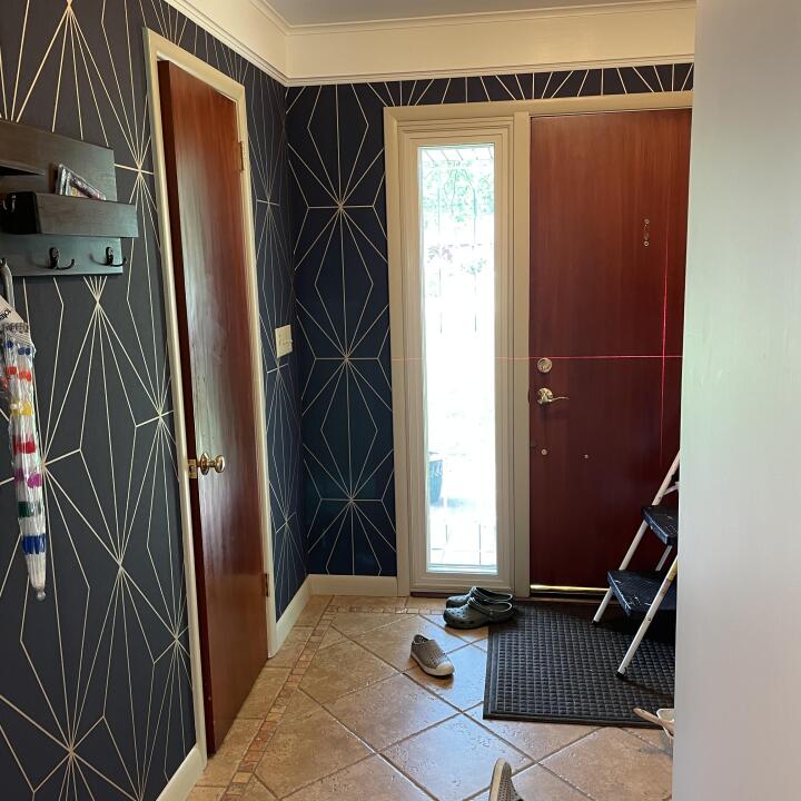
“We bought this paint as the recommended accompaniment to a wallpaper. It looked very bright in the tin but darkened to almost black and was completely wrong for the wallpaper. G&B were apologetic and said they would refund for it. It was disappointing when on asking if we wanted to try anything else, and saying we would like any sample pots of suitable blues, they proceeded to say they were all out of stock. We have decided to go with a Farrow and Ball equivalent.”
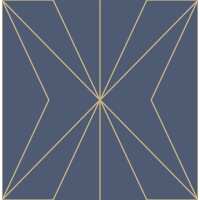
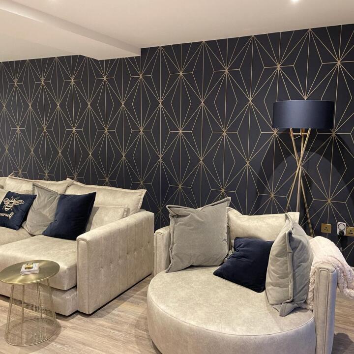
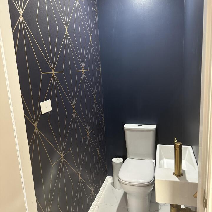
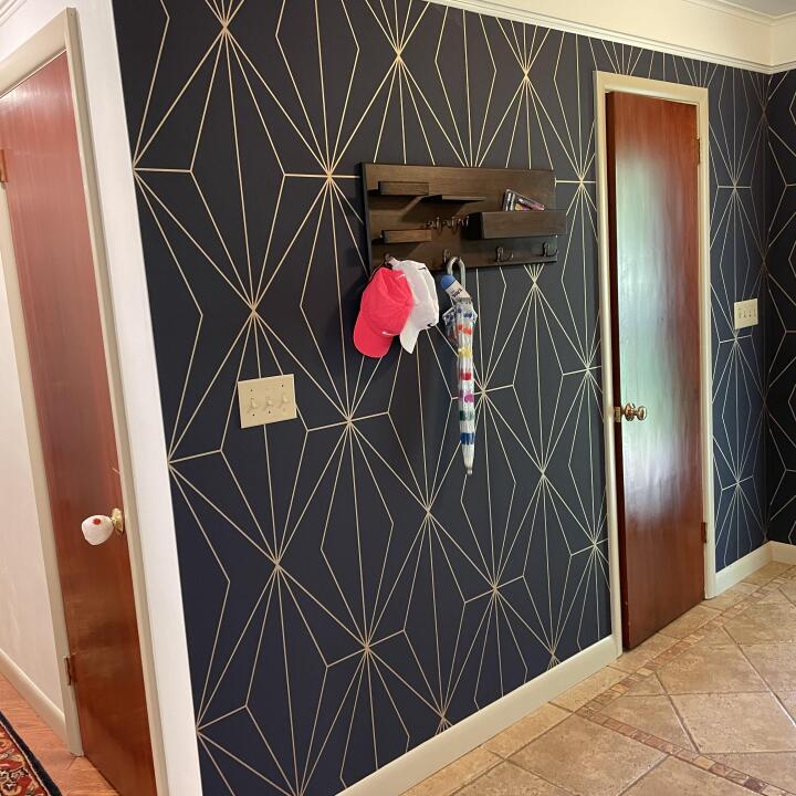
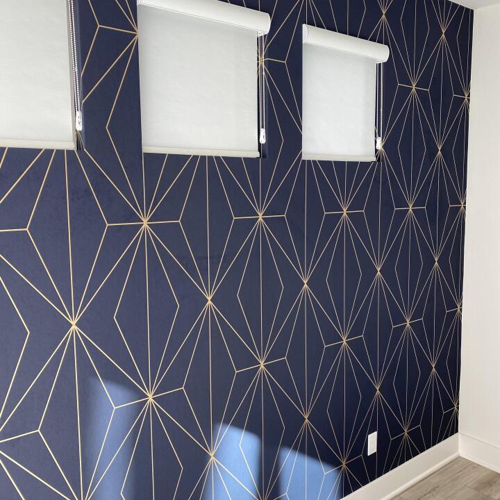
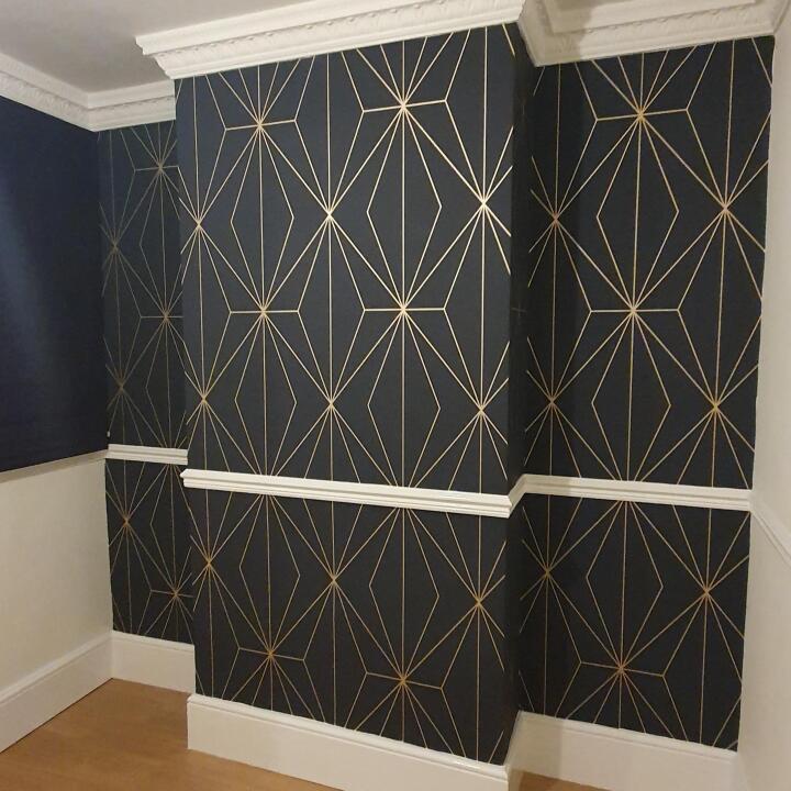
“This paper totally blew my expectations. The roll and even online doesn’t do it justice. It is amazing!!!! It’s bold, and really adds a wow factor to the area. It’s different and elegant. So incredibly pleased with this!”
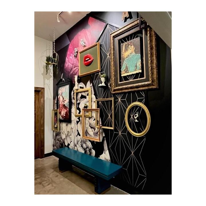
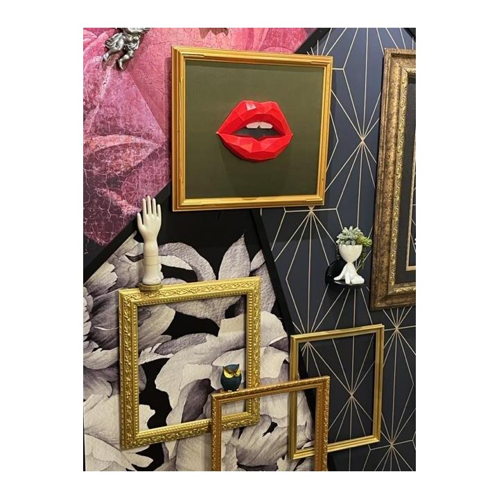
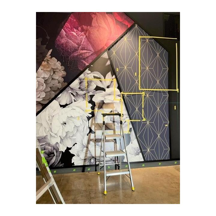
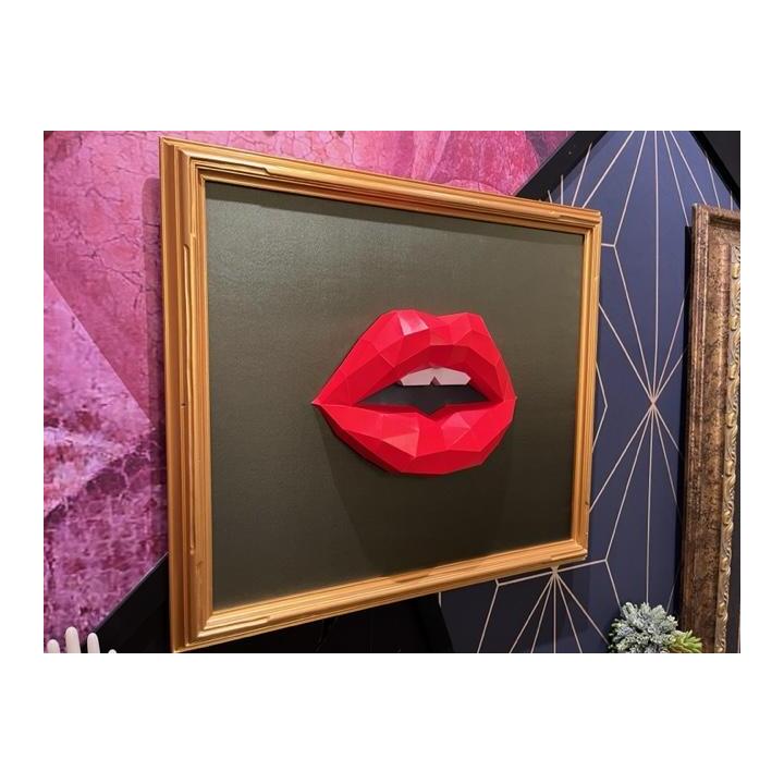
“This paper was the "masculine" aspect of the commercial design project shown. The rich navy with gold geometric pattern is a perfect complement to the large floral papers (note the rich purple mural is Timepiece Amethyst from Graham & Brown). Paper quality is excellent and pattern match was perfection!”